Senior Park Redesigned
Senior Park is a B2B platform streamlining the placement process for assisted living facilities and placement agencies for seniors.
Role
UX Designer
UX Researcher
Ideation
Interaction and Web Design
Prototyping
Duration
September 2022
Team
Sachi
Fiona
Discipline & Tools
Problem Observation, Interviews, & Analysis
User Persona Development
Rapid Prototyping (Lo-Fi)
Usability Testing & Evaluation
Figma & FigJam

Solution Preview
About the Project
For this project, we were tasked with designing and prototyping a concept to improve communication between placement agents and care home coordinators functioning in the senior housing industry.
We wanted to create a platform that focused on the user’s needs. We wanted it to be a tool where placement agents and care home coordinators could easily connect, facilitating the placement process and helping place seniors more effectively.
Goals
Discover user pain points
Understand the day-to-day tasks performed by placement agents and care-home coordinators
Define information architecture


Old version of Senior Park Website
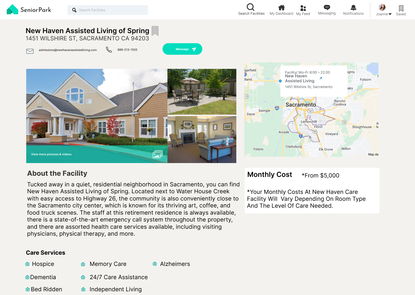
Updated version of Senior Park Website

Placement Agencies and Assisted Living Facilities face many difficulties in care coordination due to the process being time-consuming, archaic, and fragmented (undigitized)

Placement agencies and care-home coordinators need an organized, digitized, and consolidated platform to effectively communicate with one another

What do our users want to know, do, & feel?
When preparing for user interviews, we identified three main points we needed more clarification on: learn what the role of an agent and care home coordinator entails, learn about existing communication methodologies in place, and learn the tools and organizational methods currently used. With these objectives in mind, we framed both open-ended and specific questions for our interviews to provide us with the most accurate insight. Because we were designing for two key players, our questions slightly differed based on the role.
What is difficult in finding a facility whether that be online or via phone/pen/paper?
Why is it difficult for placement agents to communicate with clients AND assisted living facilities? What does that look like? What materials are used? What data is important for them to gather?
What filters could be important when searching?
What does their day-to-day look like?
What does success look like to them?
Identifying User Needs
“I need a way to see easily access client information on my phone when I’m on the go, currently I have them stored in this pink binder I bought from Staples.”
“My clients have very specific needs and only few care homes can accomodate for these needs - it takes me around 3 phone calls before I can find a facility that works”
“I’m on the phone at least 80% of the day just trying to find places for my clients”
Placement Agent
“I want to be able to let agents in my area know I have vacancies”
“As a coordinator, I’m scheduling so many tours over the phone all day everyday.”
“I need a proper way to advertise my facility - photos, amenities, size, etc.”
“My network has barely expanded in the twenty years I’ve been working as a care-home coordinator. Everyone in the area already knows everyone in the area. It would be great to find people outside of our county.”
Care-Home Coordinator

User Personas
Understanding who we were designing for gave us perspective on how the app would fit into the lives of our users. We felt it was best to focus on how our personas would think and behave as opposed to limiting ourselves to discussions about business objectives, interface, etc.


Storytelling through ideal experiences
Synthesizing goals from our research served as a lens through which we could consider not only what the app should do, but also how it should feel. By creating user journeys, the team was able to identify the main ‘plot points’ in both Joanne and Celia’s scenarios. This was also the best way to conceptualize and structure the proposed content and functionality.


Joanne, the Placement Agent


Celia, the Care-Home Coordinator

Information Architecture
Feature Prioritization
Combing our research and referring to our constructed user journeys allowed the team to come up with a broad set of features and tasks quickly. This helped us visualize content that would be useful for our users and what opportunities were available to innovate.


Sketching for efficient flows and visualizations
Then, based on the user journey we had outlined, we began to sketch different UI on how to best visualize the tasks of both the placement agent and the care-home coordinator. As we were designing, we drew inspiration from other website interfaces The client stipulated early on that they wanted us to design for the desktop. The best way to do this was through an activity called Crazy 8s - each of us rapidly sketched 8 key wireframes that would accomplish the goal with the user in mind. We did this twice - once for Joanne, the placement agent, and again for Celia, the care-home coordinator.
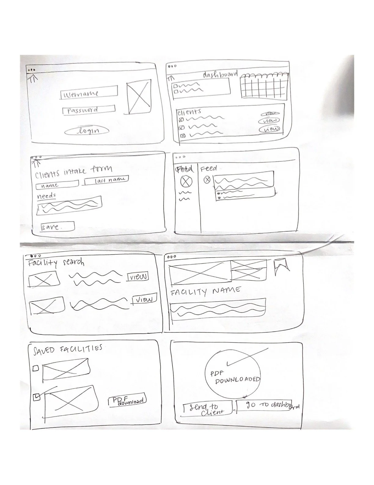

Mid-fidelity Wireframes
Our team also had to design two separate flows, one for the placement agent and one for the care home coordinator. However, based on the user journey and flow we had constructed, many of the screens remained the same for both flows as both placement agents and care-home coordinators had similar needs.

Login

Facility Details

Dashboard

Search Facility

Intake Form

Saved Facilities

Feed

Edit Facility Detail Page (Care-home coordinator)
The Refinement
Due to the time constraints set by the client, our team decided to conduct a preliminary usability test (one per flow) to gain feedback right away. We felt that by constructing multiple prototypes and conducting multiple usability sessions, our team was able to make improvements as we went while also yielding valuable feedback informing our design decisions. Changes were made to improve the major issues expressed by users based on the current design. Issues included:
The lack of onboarding screens This made it difficult to understand the flow and what was expected of the user. We made sure to give users more clear direction.
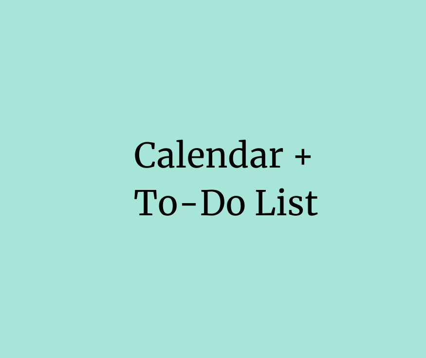
Users needed more information on the dashboard Through testing, we found that the dashboard could be a centralized location that was host to multiple functionalities (to-do lists, calendars, etc).
Buttons needed more contrast The client has provided us with the light green color and therefore had used gray as our contrast color. However, it was clear gray was not going to be stark enough to indicate a Call-To-Action.
Branding & Design System

Because this project was essentially a complete overhaul of the existing website, we decided to use the signature Senior Park green. We received feedback regarding the low contrast of the buttons on our mid-fidelity prototype so we added a new contrasting color for our Call-to-Actions like orange because of its brightness. For the secondary call-to-action buttons, we wanted to use a simple gray because of its more muted and neutral tones. For the font, Senior Park had already established Inter as its primary font. Due to Inter’s high visibility and readability we didn’t feel it was necessary to change.
Further Refinement
After conducting preliminary testing on our mid-fidelity prototype and setting a brand style, we continued building out a high-fidelity prototype which we also tested and simultaneously made changes to our design based on our findings.

1. Task Management: Keep all tasks in one place through a dashboard (Calendar, To-Do List, Resident database, Facility Details, etc). Based on feedback, it seemed that there should be a centralized location for all task-based responsibilities to make it easier to track.

2. Filtered Facility Search: Easily filter through facilities based on Seniors’ needs and schedule tours on one platform. Users also expressed difficulty searching for facilities that offered specific types of care because of the lack of a filtration system, therefore we added it as a feature.

3. Feed is the preferred Home Page: Users seemed to understand how to interact with the home page and mentioned it reminded them of other social media feeds. We made this frame the first point of contact in the experience because it kept users engaged, made the website feel alive, and in turn lead to greater customer satisfaction.

The Solution

View prototype through the perspective of Joanne, the Placement Agent

View the prototype through the perspective of Celia, the Care-Home Coordinator
Reflection What Would I Do Differently?
This was my very first client project as a UX Designer (yay!) 🎊 While I am proud of the solution our team came up with, going through the UX process while also working with a client taught me so much:
Research is extremely important - When first beginning the project, my teammate and I were unfamiliar with the senior living industry and the key players that operated in the space. Conducting a series of interviews was crucial for our understanding as we designed a platform for their needs. Had we not conducted the competitive and comparative analysis and the interviews, we would not have been able to empathize and likely delivered a product short of what businesses need.
Challenges make you stronger - During any project, it is unlikely it will be smooth sailing the entire time. Redesigning Senior Park was no different. When one of our team members unexpectedly dropped off the project, Fiona and I were working overtime to deliver our prototype to the client. We counteracted this setback by setting clear timelines and benchmarks for ourselves to ensure we were progressing at a steady pace. Ultimately, Fiona and I were thrilled with how much we had learned in such a short period of time and were extremely proud of what we had accomplished.
Focus on one feature instead of multiple - When conducting user interviews, it becomes easy to take every piece of feedback and “need” of a user as an item on a feature wishlist. It’s up to designers and the iterative process to narrow down which of these features are of use to the group as a whole.
Failure is all part of the process - It’s so important to remember that if something doesn’t work, you didn’t fail - you just found another way that didn’t work. When starting out in design, it can be so simple to get hung up on what doesn’t work as a “failure” but we have to remember that by poking holes in our own designs, we also work to build them back up (and make them stronger).
Adhere better to WCAG next time - Due to the time constraints, we made sure that our deliverable had everything the client and team discussed + all our additional findings. However, if we had more time, we would have fleshed out the project more to abide by the WCAG standards.